Having looked at a few good designed websites.
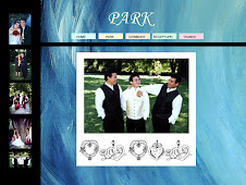
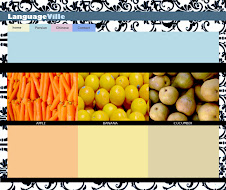
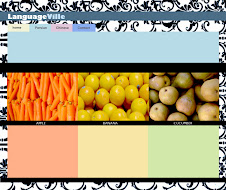
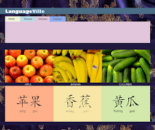
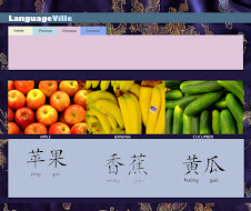
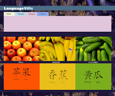
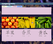
Think its very clear to see that they all have a very organised manner/gride system (in most instances 99% of the time even if the style is not clean still organised) so that the browser is not lost and can navagate and make sense of things easily since people don't generally give webpages that much time (first impressions really cound in webpage design).
Also a couple of the other factors/elements that they all seem to have going for them is the use of colour that they actually have a colour scheme in place thoroughout the website which is 99% of the time established somewhat in the homepage. Another few elements that each have in common is the fact that their layout is clean and not cluttered with too much, there is plenty of 'white...space' making it that much clearer and easier for the browser. Also another thing I noticed that font treatment is very similar thoughout the webpages which I know is party because that is how the web design programes are set up/option is but even so they generally don't have more then 2 font sizes as far as I can see.
Subscribe to:
Post Comments (Atom)













No comments:
Post a Comment